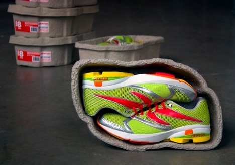
 So someone has come up with a way to protect not only the environment through recycled packaging but also a way to protect your footware at the same time. This nifty idea is based off of an egg carton design used with the same spongy material that is used as a cushion. Because of it's design it is stable enough to be stacked and the contouring design saves space.
Monday, December 13, 2010
Shoe Carton?
So someone has come up with a way to protect not only the environment through recycled packaging but also a way to protect your footware at the same time. This nifty idea is based off of an egg carton design used with the same spongy material that is used as a cushion. Because of it's design it is stable enough to be stacked and the contouring design saves space.
Collective Package Design from JAPAN
 These designs from a collection of sweet enticing stores in Japan are simple, clean, and delicate. The packaging is done in a way that makes you not want to open them for fear of ruining them. They are so pretty that that could be collected and used as a decorative statement in your home or your desk at the office. Lovely.


Appetizing Packaging

 I'll reiterate from a previous post.... Clean design is something I'm attracted to. Clean, open space with well chosen type and saturated color that gives the design a bit of a high contrast effect catches my eye and this is something that all of these designs have. For a product such as a drink to be packaged in something that looks clean is important as well as having a big bold picture of a thirst quenching image on the product. Appetizing design.


Color Texture and Allure....
 I love this image. I actually forget what site I got it from and what all the mediums are that were used, but I find it to be gorgeous. The colors, the blending of warm colors, the effect of the high contrast, and most of all the texture stands out to me and grabs my attention. For me texture and color are alluring. It will pull me in every time.
More Effective, Clean Logos


 These logos I feel, are what I call smart logos. These are sophisticated thought out logos that play into the name of the company. You can look at all of these logos without there signature next to it and get an idea of what the company is about.

Thursday, October 28, 2010
CD COVER design
 You can find a wide range of CD cover designs stemming from photographic, illustrative, typographic etc. Hopefully there is a connection with the artists musical statement embedded in the visual. Some of the covers I've selected to show demonstrate appealing qualities. The Chili Peppers cd exhibits good use of contrasting colors. Color being something that draws me in immediately. They combine warm and cool while at the same time flipping the imagery and still maintaining balance in the piece. I love the abstract illusiveness of the Rise Against cd. Nickelback manifest balance with diaganol motion and again, warm and cool combination. The Led Zepplin cd is just stimulating to me. There's alot of play with space and the formation of dots.(which is

 how I see it)
Thursday, October 21, 2010
The Perfect "Fat Ass" Mug :o)
 I LOVE the design of this mug by Dominic Skinner. LOVE, LOVE, LOVE it!! Right away I think of a good time with a great movie, ice cream, and oatmeal raisin sitting inside my mug of milk sprinkled with cinnamon! MAN...I'm having a ball!! :o) Sorry... getting carried away- but I really do like this thing. (WANT ONE) Very convenient piece of equipment, especially if you're like me who loves to eat and watch something good at the same time. No need for a plate. Love it....Ordering NOW!
Perspective, Lines, Negative Space, Typography....basics applied to POSTER DESIGN
 I like the fact that the movie poster for "Taxi To The Dark Side" played with the imagery for the shadows of the soldiers walking off. Creating the stripes of the flag for the shadow of soldiers immediately tells the story. And this, I feel was a good idea being as though the title tells little of what the audience is to view from this film. It's a contrasting title, in fact. Good use of perspective and the gradiation of value on the red stripes which mimmick the fade out of a casted shadow.
 Considering that I'm currently learning about positive and negative space as well as lines, I felt the poster design for the film "Today" was excellently excuted as a great example of these elements. Because of the negative space and the rounded shape that is created towards the top left and bottom right of the page, a smooth directorial flow is happening. This flow directs your eye to the well illustrated image of a mans face in the poster. Because the design is done graphically the negative space bleeds with the imagery to create the mans jacket and head of hair. I really like this.
 The "Shootdown" poster demonstrates effective typographic design that, despite that there is no illustrative imagery, you still can relate the meaning of the title "Shootdown" with what is to happen in the film. The type for the title is wisely bold and strong to allow for one to see through the closely scattered background type, that of which plays as the shattering of a gun shot.
Thursday, September 23, 2010


The Surofi logo transformation from old to new is done beautifully. With the logo they went from an illustrative image to a simplistic typface for a logo with a fish hook for the letter u being it's only form of illustration. For the company's annual report pamphlet they keep the color scheme going. They've incorporate an updated version of the cartoonish looking fish with an image of a fisherman holding freshly caught poultry which denotes a message of fresh fish being their goal. The color play of the photography is, to me, sooo engaging. I just LOVE it. Love how they incorporate the turquoise color symbolic of the ocean.
While sifting through this site, I enjoyed seeing the process of how they manipulated the photograph of the ocean, the man in his clean fisherman gear and put everything together making the photograph a gritty yet clean depiction of what the people of that company go through to give the people what they want. All in all, I'd say the designer behind this did his job telling the story of the company.
Reconstructing a plain looking FONT


 I find Helvetica to be one of the most unappealing fonts in the world but today I stumbled upon a website that had a number of logos that were inspired by the font called Helvetica. As I take a look at the sufficient amount of decent looking logos, I thought to myself..."what is making this font look ok to me?" Well, with the help of some creative designers the facelift of helevetica was surely evident. With Crate & Barrel, I noticed taking out the kerning had a lot to do with reconstructing of the appearance. Having all the letters live close to one another gives it a cleaner, more expensive look which is fitting for a furniture retail business. I also noticed that by adding a simple twist to a letter such as the "L" in Staples to make it look like a staple, or Microsofts missing piece of the letter "o" completely changes what can be considered a boring font. Some others chose to position a logo around the type thereby assembling an appealing piece to observe. Interesting..... I don't think I've ever really considered challenging myself to take something I instinctively find disdainful and recreate it to my liking. I can now say I may just try. Off to play....
Wednesday, September 15, 2010
BUSINESS CARDS
 I thought the idea of this business card by a company named DUO was quite interesting. Having the image of a conjoined popsicle then breaking it off, splitting the card in half, was a charming way to play on the name of the business. The designer continued his connection with the shapes of the popsicle to procreate the typeface of the company name. CUTE! Just simply cute! The only thing I don't really care for is the perforation at the top of the card once divided. That produces a inexpensive look to a well thought out idea. I wonder if the designer could of created this on plastic and had an inseam in the middle of the card to simply break apart instead. 1) The shine and sturdiness of the card would have established a refined appearance 2) It would have given an high quality look, therein making aware of what the customer will get. Overall I love the thought behind it.
World's First Magazine

On the website oddee.com I came across a listing of the "world's firsts". In that list was what is considered to be the world's first known magazine "first published in 1731, in London". It's strange to see a magazine cover look like an insert of a classic novel. One of the first things that threw me off was that there was an obscene amount of text on the cover with what appears to be roman numbers listing what one will find throughout the pages. I suppose in history the table of context was the cover page. Everything is positioned in the center with no real design layout esthetic aside from the illustration of "St. John's Gate. Considering how time consuming it was in those days to put together a historical recount or just simply write a story by means of woodblocking and typesetting, appreciation for such is inevitable for me. It appears as the type made up most of the design. Where you placed it, how big one made it, how bold should it be, should it tilt.....these are all questions that still go on today but with more elements to add to the equation. THanks to Photoshop, photographs, the options of glossy or matted paper types, distortion of typeface through computer programs, the layering of images, the evolvement of open and negative space....I mean the opportunity to be creative are endless. ( and, I might add, effortless in most ways)
World's First Album Cover

On this same website there was a listing of the first album cover designed by a "23 year old...named Alex Steinweiss". The evolution of albums in it's self says it all. Some kids today might ask "Huh...what are albums?" oh boy.....
Thursday, September 9, 2010
LOGOS
 What makes Apples logos and advertising appealing to me is that they make everything so clean and to the point. With the new Ipod touch ad they've incorporated colorful fingerprints to distinguish itself from other touch pad type of advertising. Almost making the competition question...."Why didn't I think of that?" Simple and to the point. That's Apple. From their literal Apple symbol as a logo to their sunonumos white clean palette for a background which focuses the audience on the all important, shiny-gloriously hailed product to the new colorful yet still clean and crisp Ipod Touch ad. Love it! Love Apple.....what can I say.
MOTION GRAPHICS
Ok soooo.. the fact that motion graphics is part of graphic design just thrills me, with trailers having the ability to excite me for some reason. I've seen the movie Catch Me If You Can when it first came out and have always heard good things about the opening sequence. Considering that the film is about a con artist who takes on a legion of professional identities, the designer of this piece crafted together a well executed animation that goes hand in hand with the plot of the movie while at the same time playing with the typography. The typography acts as another extension of a summary to the movie by transforming into elongated lines used as escape routes for the con artist character. The ever changing illustrated figure glides up and down through the shifting text and side doors that appear through the lettering. The music chosen by the designer, fits so perfectly to depict the slyness of the main character played by Leonardo Dicaprio. This is a creative way to intro a movie and foreshadow what the movie entails while peaking interest to the anticipated viewers. This opening is filled with imagination, explanation and understanding. Most opening credits are overlooked by conversation and the crunching of popcorn. I would say that this is an effective opening for a motion picture that holds your attention and puts off your appetite to munch.....at least until the movie starts.
I LOVE trailers! I wasn't really aware of this love for trailers until recently but I do love the ability to piece together a 1 minute clip of activity combined with music and chosen typography that will convey the message of a cinematic piece. Something has to draw you in and make you pay attention. STOP. LOOK. LISTEN. When the trailer for the movie Inception came out, that's what I did. Now, some may say that there is nothing special about the trailer but it caught my attention. I've watched it several times wanting to see this movie while not having a CLUE what the movie is about.....BUT it peaked my interest. To take the elements of strong music, strong type, strong movie clips and roll them into a teaser of interest.... gets my vote, as well as my 10.50 for viewership. Ok, make that 20.50 for popcorn and a drink. GEESH!!
Subscribe to:
Comments (Atom)