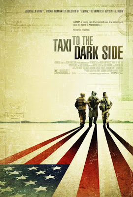
I like the fact that the movie poster for "Taxi To The Dark Side" played with the imagery for the shadows of the soldiers walking off. Creating the stripes of the flag for the shadow of soldiers immediately tells the story. And this, I feel was a good idea being as though the title tells little of what the audience is to view from this film. It's a contrasting title, in fact. Good use of perspective and the gradiation of value on the red stripes which mimmick the fade out of a casted shadow.


Considering that I'm currently learning about positive and negative space as well as lines, I felt the poster design for the film "Today" was excellently excuted as a great example of these elements. Because of the negative space and the rounded shape that is created towards the top left and bottom right of the page, a smooth directorial flow is happening. This flow directs your eye to the well illustrated image of a mans face in the poster. Because the design is done graphically the negative space bleeds with the imagery to create the mans jacket and head of hair. I really like this.
The "Shootdown" poster demonstrates effective typographic design that, despite that there is no illustrative imagery, you still can relate the meaning of the title "Shootdown" with what is to happen in the film. The type for the title is wisely bold and strong to allow for one to see through the closely scattered background type, that of which plays as the shattering of a gun shot.
 You can find a wide range of CD cover designs stemming from photographic, illustrative, typographic etc. Hopefully there is a connection with the artists musical statement embedded in the visual. Some of the covers I've selected to show demonstrate appealing qualities. The Chili Peppers cd exhibits good use of contrasting colors. Color being something that draws me in immediately. They combine warm and cool while at the same time flipping the imagery and still maintaining balance in the piece. I love the abstract illusiveness of the Rise Against cd. Nickelback manifest balance with diaganol motion and again, warm and cool combination. The Led Zepplin cd is just stimulating to me. There's alot of play with space and the formation of dots.(which is

 how I see it)


