 So someone has come up with a way to protect not only the environment through recycled packaging but also a way to protect your footware at the same time. This nifty idea is based off of an egg carton design used with the same spongy material that is used as a cushion. Because of it's design it is stable enough to be stacked and the contouring design saves space.
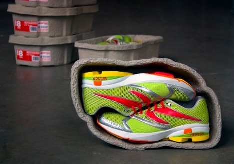
Monday, December 13, 2010
Shoe Carton?
So someone has come up with a way to protect not only the environment through recycled packaging but also a way to protect your footware at the same time. This nifty idea is based off of an egg carton design used with the same spongy material that is used as a cushion. Because of it's design it is stable enough to be stacked and the contouring design saves space.
Collective Package Design from JAPAN
 These designs from a collection of sweet enticing stores in Japan are simple, clean, and delicate. The packaging is done in a way that makes you not want to open them for fear of ruining them. They are so pretty that that could be collected and used as a decorative statement in your home or your desk at the office. Lovely.


Appetizing Packaging

 I'll reiterate from a previous post.... Clean design is something I'm attracted to. Clean, open space with well chosen type and saturated color that gives the design a bit of a high contrast effect catches my eye and this is something that all of these designs have. For a product such as a drink to be packaged in something that looks clean is important as well as having a big bold picture of a thirst quenching image on the product. Appetizing design.


Color Texture and Allure....
 I love this image. I actually forget what site I got it from and what all the mediums are that were used, but I find it to be gorgeous. The colors, the blending of warm colors, the effect of the high contrast, and most of all the texture stands out to me and grabs my attention. For me texture and color are alluring. It will pull me in every time.
More Effective, Clean Logos


 These logos I feel, are what I call smart logos. These are sophisticated thought out logos that play into the name of the company. You can look at all of these logos without there signature next to it and get an idea of what the company is about.

Thursday, October 28, 2010
CD COVER design
 You can find a wide range of CD cover designs stemming from photographic, illustrative, typographic etc. Hopefully there is a connection with the artists musical statement embedded in the visual. Some of the covers I've selected to show demonstrate appealing qualities. The Chili Peppers cd exhibits good use of contrasting colors. Color being something that draws me in immediately. They combine warm and cool while at the same time flipping the imagery and still maintaining balance in the piece. I love the abstract illusiveness of the Rise Against cd. Nickelback manifest balance with diaganol motion and again, warm and cool combination. The Led Zepplin cd is just stimulating to me. There's alot of play with space and the formation of dots.(which is

 how I see it)
Thursday, October 21, 2010
The Perfect "Fat Ass" Mug :o)
 I LOVE the design of this mug by Dominic Skinner. LOVE, LOVE, LOVE it!! Right away I think of a good time with a great movie, ice cream, and oatmeal raisin sitting inside my mug of milk sprinkled with cinnamon! MAN...I'm having a ball!! :o) Sorry... getting carried away- but I really do like this thing. (WANT ONE) Very convenient piece of equipment, especially if you're like me who loves to eat and watch something good at the same time. No need for a plate. Love it....Ordering NOW!
Subscribe to:
Comments (Atom)